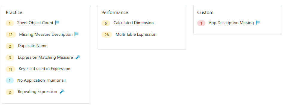
QSDA Pro 3.6 introduces Custom Flags — a way to enforce your organization’s unique standards alongside QSDA’s built-in analysis.
In addition to built-in QSDA flags that expose findings like errors and best practices, you can now define additional flags specific to your site.
Do you have unique company standards like:
Every App and master measure should have a description?
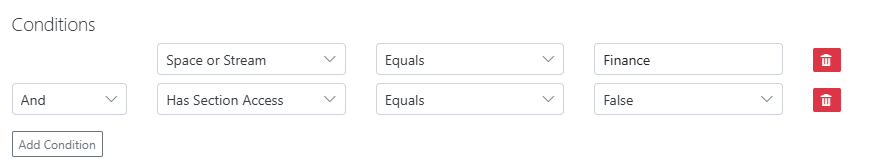
Apps in the Finance stream should have Section Access enabled?
Mobile Apps should have no more than ten objects per sheet?
You define the triggering condition, flag category and detailed flag description. Any triggered flags will appear in QSDA alongside the built-in flags. Custom flags use a distinctive icon to distinguish them from built-in flags
You can assign the new flag to one of the built-in categories like “Practice” or assign to the new “Custom” category.
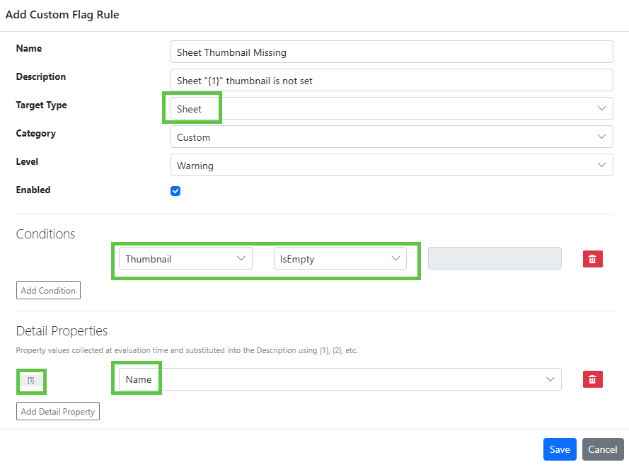
Create and edit rules under Admin > Custom Flags
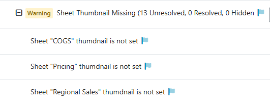
In the rule above, we define that every Sheet must have a thumbnail. When we select a Target Type of Sheet, properties of Sheet are made available in the Conditions and Detail Properties dropdowns. QSDA evaluates these conditions during analysis and raises the flag when they are met.
The Detail Properties are used to collect {n} placeholder values that can be substituted in the Description field. When this flag is raised in the QSDA analysis, the Description placeholder will be filled in like this.
You may have multiple conditions defined with and/or.
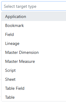
We’ve done our best to expose the data we think customers will need for rules. We currently expose these Target Types:
Each target type offers a number of different properties. If we missed something you need or you just have a question about how we can meet a specific requirement, please reach out to our friendly Motiosupport team.
Summary: A rich set of regular expression functions has recently been added in Qlik Sense cloud and client managed. In this post I’ll introduce some use cases for this feature and show how to instantly become a regular expression master.
Regular Expressions (RegEx) is a powerful string pattern matching language that has been available in many programming and scripting languages for decades. Qlik Sense Cloud and the client-managed May 2025 release brings the full power of RegEx to Qlik via a new set of Chart and Load Script functions.
What can you do with RegEx?
Validate that a field value matches a specific pattern. e.g. Is this a valid phone number or credit card?
Extract substrings from a larger string.
Reformat a string to match your rules.
Here’s an example to get us started. I’ll validate that “Phone” values match the allowed format for US phone numbers.
The string ‘^(?:([2-9]\d{2})\ ?|[2-9]\d{2}(?:-?|\ ?))[2-9]\d{2}[- ]?\d{4}$’ is a regular expression pattern that represents the validation rule for US phone numbers. Like any powerful and syntactically terse programming language, RegEx patterns can look a little daunting at first. Here’s the explanation of what that pattern enforces.
This regular expression for US phone numbers conforms to NANP A-digit and D-digit requirements (ANN-DNN-NNNN). Area Codes 001-199 are not permitted; Central Office Codes 001-199 are not permitted. Format validation accepts 10-digits without delimiters, optional parens on area code, and optional spaces or dashes between area code, central office code and station code. Acceptable formats include 2225551212, 222 555 1212, 222-555-1212, (222) 555 1212, (222) 555-1212, etc.
Did I write that pattern myself? No, I copied it off an internet site. There are many internet repositories with thousands of patterns you can copy from. Those repositories have quickly been supplanted by AI chatbots.
Let’s look at another example. I recently answered a question on Qlik Community where the poster wanted to extract First & Last names from strings like:
James SmithMary JohnsonJohn WilliamsPatricia BrownRobert Jones-GarciaMichael MillerLinda Davis
The Qlik function ExtractRegEx is the function we want to use. I know enough RegEx off the top of my head to create a pattern to split on the capital letters and spaces. But how do I deal with the hyphen in “Jones-Garcia”? It would make my head hurt.
AI is a great tool for generating RegEx patterns! Turn to your AI chatbot of choice. I use Copilot but I expect ChatGPT or any of the popular bots would do the job as well.
Asking Copilot to generate the pattern
The nice thing about this approach is I don’t have to explicitly state “..and handle hyphens”, I just supply sample data.
Is this pattern correct? You could just plug it into Qlik but I prefer to first validate using a RegEx tester. There are a number of free tools, regex101.com is the one I usually use.
After validating and potentially tweaking the pattern we use it in Qlik script like this:
I do recommend you spend 30 minutes learning the basics of RegEx to make best use of assistants and testing tools.
You may have used the Qlik script SubField function to split a string in multiple rows based on a delimiter such as a comma. But SubField won’t do when comma is part of a quoted string as is common in CSV files. The new SubFieldRegEx function handles this with ease.
Don’t quit if RegEx only gets you 90% of the way there. Stack some Qlik functions like the where clause above to finish the job.
RegEx implementations in other languages use an option flag to indicate a case-insensitive operation. Qlik has opted to use an additional function with the suffix “l” to indicate a case-insensitive operation. So:
MatchRegEx – case sensitive
MatchRegExl – case insensitive
A really nice feature of the Qlik MatchRegEx function is that it allows for multiple match patterns to be specified.
The Qlik RegEx functions are documented in the String Functions section. I do wish they had given the functions a separate section. I’ll summarize the available functions here with the caveat that these are correct at this time of this posting.
ExtractRegEx() extracts text from an input string expression using the specified regular expression pattern. The function returns a null value if no matches are found.
IndexRegEx() searches the input string and returns the starting position of the nth occurrence of the specified regular expression pattern.
MatchRegEx() compares the input string with one or more specified regular expression patterns, and returns the numeric location of the regular expression patterns that match.
ReplaceRegEx() returns a string after replacing one or more matches between an input string and a specified regular expression pattern.
SubFieldRegEx() extracts text from an input string expression, using the specified regular expression pattern as a delimiter.
There are a number of useful optional parameters, see the documentation for details. There is also ReplaceRegExGroup that I have not yet wrapped my head around. Feel free to post a use case in the comments.
Are you going to use these functions a lot? Probably not. But when you need to clean messy data or extract relevant data these functions can be invaluable. I’ll leave you with one last example, extracting data within HTML tags.
QSDA Pro 3.3 was recently released. Here are a few of the key features in this release.
The UI is available in Portuguese, Spanish and English.
The compact Applist displays more metrics. You can work with multiple apps and analyses in less screen space.
App memory footprint is part of the top level Applist. The memory value is highlighted when the app memory exceeds a configurable percentage of your tenant quota.
Optionally filter connections by stream or space name, or space type.
“Repeating Expression” is a new flag raised when an expression appears repeatedly in the app. The recommendation is to create and use a Master Measure.
Under the hood 3.3 contains several improvements that make the UI faster and simplifies setting up connections.
Read all the changes in 3.3 and previous releases here
Version 3.3 is the recommended release for all QSDA Pro customers. If you are upgrading from QSDA V2 be sure to read the V3 Upgrade Considerations.
Feel free to reach out to Motio Support if you have any questions about upgrading or configuring your QSDA Pro install.
Summary: A look at techniques to reduce the memory footprint of your Qlik Data Models.
There are good reasons to reduce the memory footprint of your Qlik Apps. Smaller Apps tend to perform better and require fewer server resources. Qlik Cloud imposes size quotas and there is a financial cost to exceeding the quota.
In this post we’ll look at techniques to reduce the memory requirements of your data model.
First, lets review how Qlik Sense stores App data in memory.
The Qlik Load script transforms your data into two types of internal data structures.
A Symbol Table is created for each field. The Symbol table contains a list of the distinct values of this field. The overall size of the symbol table is therefore a function of how many values and the width of the values.
Logical Tables are the tables we see created in the data model, i.e. fact and dimension tables. The Logical tables contain one row for each row of data. The tables do not contain the field values directly. Rather they contain a pointer to a value in the associated Symbol table. This pointer is sometime called an Index.
The width of a pointer is the number of bits required to index the number of values in the Symbol table. For example, in the image above we have 5 values for “Year”. This would require 3 bits as 2^3 is 8, which would cover the required 5 values. 2^2 would be too small as that would only cover 4 values.
MyQSDA Pro tool shows the memory required for each field, including a breakdown by Symbol and Index.
I’m going to use QSDA Pro for my demonstrations in this article.
Using less memory for fields involves reducing the size of the symbol table, the index, or both. There are four techniques we can employ to reduce field memory:
Eliminate the field
Reduce the number of field values
Optimize field values to reduce width, including AutoNumber
Reduce the number of rows
Let’s look at each of these options.
Eliminate the field
Removing the field from the data model is the easiest way to reduce memory :). Of course this is only viable if the field is not used by your application. To determine if a field is used, you must consider all the places a field may be referenced — master items, variables, charts, bookmarks, etc — for both public and private content. Fortunately, QSDA scans all public and private content and makes the inuse determination for you.
In some cases you will not want to drop a field as you anticipate it being used in the future. The benefit from removing fields is relative to the size of the field. When considering whether you want to drop a field, look to the largest fields first where you will gain the most benefit.
QSDA Drop Unused Fields Dialog
Reduce the number of field values
Reducing the number of distinct values will reduce both symbol and index space. How might we do this?
A common scenario involves timestamps. For example let’s look at a field named “ShipTime” which displays in our app as hh:mm:ss, reporting the time an order was shipped. The analysis requirement is that occasionally an analyst will need to see this value in an order detail chart. This field has 459,918 distinct values. Something seems off. There are only 86,400 possible hh:mm:ss values per day and we only ship during one shift so I would expect to see no more than 28,800 values.
When I examine the values in the app I discover the field contains an entire Datetime value and the display format hh:mm:ss is being used in the chart. I don’t need the date portion. I’ll use the Frac() function in the script to extract just the time.
Reload followed by a new QSDA Analysis and here’s the result below. A massive reduction in distinct values and associated savings in both symbol and index. This reduces the total memory for this field from 5200KB to 345KB.
Another potential scenario for this field is that the original developer required both the date and time. In this case our approach is to split the datetime into separate Date and Time fields like this. Remember that formatting functions like Date() and Time() do not change values, we must use numeric functions like Floor() and Frac().
If I need to display the “Ship timestamp” in a chart, I’ll do it like this in the chart:
ShipDate & ' ' & ShipTime
A QSDA analysis now shows a total of 863KB for both fields. A big reduction from 5200KB!
Other potential ways to reduce the number of values:
Drop seconds or fractions from Time fields.
Some accounting systems return fractional amounts, or you may have unneeded fractions due to a calculation. Round the final amount to the penny or appropriate magnitude.
Optimize field values to reduce width
Reducing the width of the field values decreases the Symbol space but not the Index space. How can we reduce the width of a value without changing the business meaning of the value? Isn’t a value a value?
We’ll start with the easy way — AutoNumber. The AutoNumber statement (and AutoNumber function) translates values into a set of sequential integers. This is useful for compacting key values. We typically don’t need to see the key values, we just need to them to link our tables together.
AutoNumbering a field is done by adding this statement at the end of your script:
Here’s the before and after sizes for SalesOrderDetailID, showing a total reduction of 143MB.
Before AutoNumber
After AutoNumber
Note that the symbol space has been completely eliminated! When the symbol set consists of sequential integers, Qlik does not store the symbols. Instead, the index value is used as a proxy for the symbol value.
Now we need to dive a bit deeper into the actual format of a symbol table. The symbol table diagram at the top of this post is a bit of a simplification.
Generally speaking, strictly numeric values can be stored in 8 byte cells. For a field that contains only numeric values the symbol table is an array of 8 byte values.
We can index to the nth value simply by multiplying by 8. This is a very efficient and compact storage format. In QSDA these fields will show an Average Symbol Width of 8.00.
QSDA Fields
For fields that contain strings, the symbol table layout is a bit different. As strings can be of varying length, an array of fixed cells won’t do. If there are any strings in the field, the entire field is considered “mixed”.
The symbol table for a mixed field is an array of 4 byte pointers that point to symbol values elsewhere in memory. The values consists of:
1 byte flag
The varying length string
1 byte null terminator
The total symbol space for a string is 6 bytes plus the length of the string. The storage for string “a” would be 7 bytes.
Looking at the “LastName” field in the image above, we know that each symbols value carries a 6 byte overhead. We can infer that the average length of the LastName strings is 6.54. That is, 12.54 – 6.
When the value is a Dual() value, the symbol value picks up an extra 4 or 8 bytes to hold the numeric value. 4 bytes is used for integers, 8 for decimal values.
The total symbol space for a dual value is 6 bytes plus the length of the string, plus 4 or 8 bytes.
A field may contain both string and dual types. Dual is a value attribute, not a field attribute. For more on that topic see “Dual Storage vs Dual Behavior“.
Ok, we’ve just gone down a deep rabbit hole. Maybe interesting, but is this important to reducing the overall memory footprint of your app? Generally no, sometimes yes. Let’s look at some examples.
Sometimes fields that are strictly numeric get inadvertently loaded as Dual() values. Certain operations including where clauses in loads can cause this behavior. Frankly, I don’t have comprehensive understanding of all the ways this can happen. But when it does happen, we can see numeric fields having a symbol size of more than 8.
The typical way to return these fields to 8 bytes (if you can’t fix the root cause of the issue) is to wrap the field with Num() or +0 when loading.
Num(UnitPrice) as UnitPrice
UnitPrice+0 as UnitPrice
I prefer neither approach. I typically use a TempFormat table instead.
Is it worth the trouble to fix these? At first glance it may look like a big deal, but the memory savings is typically small.
The UnitCost field occupies 40MB and the symbol width should be 8 instead of 13.45. Almost all of the storage is in the Index Bytes. The field has a relatively small amount of values. Making those 2,011 values 8 bytes each would save me a total of 10967 Symbol Bytes. (27055 – (2011 * 8))
All that said there are occasions when you have a larger number of distinct values and this can make a significant difference. I almost always “fix” these fields without giving it too much thought as it’s easy to do with a tool like QSDA.
Reduce the number of rows
Reducing the number of rows that reference a field decreases the Index space, but not the Symbol space.
Wait! Are you suggesting I load less data? No, I’m talking about data model changes that will not change the business value.
A typical opportunity to reduces rows is when you have very sparse data on a large fact table. Consider an OrderDetail table that includes return information on each Order Line. Only 0.5% of Order Lines get returned, so we end up with a lot of Index space pointing to nothing. This is indicated by a low Information Density for the table field.
QSDA Table Fields
These four Return fields in the SalesOrderDetail table require 23.28MB.
By moving these fields to a new “Returns” table, linked by SalesOrderDetailID, the Return fields and the linking key now require 227KB — a savings of 23MB, a relatively significant amount.
I hope you found some useful tips in this post. If you want to learn more about how QSDA Pro can help you optimize your Qlik Apps, join me on Nov 19 for the Click Less, Qlik More – QSDA Pro webinar or reach out to us.
Longish post today where I show off the power of QSDA Pro to reduce Qlik App resources, saving you money and creating a more responsive experience for your users.
As a follow on to my last post “Help! My Qlik Cloud Reload Exceeds Quota!” I’m going to dive deeper into the available QSDA features to reduce memory requirements of a Qlik App. As a bonus we’ll use QSDA to improve the performance of a chart.
There are many good reasons to optimize your Qlik Apps to a leaner size. Smaller apps tend to perform better and place less demand on your server resources. If you are a Qlik Cloud customer, or planning a move to Qlik Cloud, App memory size impacts your license tier — and therefore your direct monthly costs.
In this post our starting point is I that have identified the App “BikeShop Sales” as having a large (597 MB) footprint. I got this information from Qlik App Metadata Analyzer as shown below.
Qlik App Metadata Analyzer
I could also have identified this memory footprint in QSDA Pro when we select this App from the list.
QSDA Applist
Let’s see how QSDA Pro can help. I’ll launch a new Analysis and give it the Description “Baseline”.
When the analysis completes press “View” to see the results.
QSDA Analysis Summary page
In the Resources card I see that unused fields occupy 383 MB — almost 2/3 of the base data model! Unused fields are fields that are not used anywhere in the front end. They can be removed without impacting the contents of charts or the user experience.
I also see some other suggested savings in dropping unused tables (“All fields unused but keys — 439 KB”) and a 530 KB savings by AutoNumbering keys.
A fast and simple way to remove unused fields is to drop them at the end of the script with a “DROP Fields …” statement. AutoNumbering is also best done at the end of the script. Let’s implement the QSDA recommendations. Open the Qlik Data Load Editor for “BikeShop Sales” in another browser tab.
The QSDA Tools menu provides a handy Script Generator to generate recommended script statements. Select the script generator from the Tools menu.
QSDA Tools menu
In the Script Generator > AutoNumber tab select the top checkbox to select all recommended fields. Press the “Copy” button to copy the generated AutoNumber statement to your clipboard. Paste the statements at the end of your Qlik Script. Repeat for the Drop Fields and Drop Tables tabs. (I won’t use the Load Statement tab just yet).
Now that I have updated the script with the AutoNumber and Drop statements, Reload.
Reload with AutoNumber, Drop Fields, Drop Tables
Returning to the QSDA App Card, I can see that Base App Memory is now 213 MB. Quite the savings from 507 MB!
App card after reload
At this stage, I recommend running a new analysis to confirm that the script changes have not introduced any problems or new issues.
Note that Reload Peak Memory is unchanged, because we loaded the unused data before we dropped it. Reload memory has an impact on the performance of on-prem servers and for Qlik Cloud, reload memory is a direct cost.
Can we use less reload memory by not loading the unused fields and tables? It may be that a field is used the load script but is not used in the front end, so you have to examine your script to determine. This very clean script loads directly from QVDs so the answer is clear.
I’ll start by commenting (or removing) the tables we don’t need instead of dropping them at script end. To identify the unused tables I can refer to the previously generated script, the Flags, or return to the Script Generator tool in the Baseline analysis.
What about Tables with both used and unused fields? Can I easily load just the used fields and omit the unused fields? QSDA Script Generator to the rescue again. Open the Script Generator > Load Statement in the Baseline analysis and sort on the “Unused Bytes” column. Select the SalesOrderDetail table.
A Load statement fieldlist for [SalesOrderDetail] will be created with unused fields commented out. You can exclude the unused fields entirely by unchecking the “Include Unused Fields” box. I’ll start with just the SalesOrderDetail table for now. Note that the other tables with big Unused Fields savings, Notes and Customers, are already being excluded completely.
Before reloading, I’ll remove the AutoNumber and Drop statements I added earlier. Many of those drops are no longer valid as I am not loading the fields at all. Here is the updated load script.
Updated script to exclude unused fields
After reloading, I return to the QSDA App Card. Reload Mem is reduced from 693 MB to 268 MB! I’ll run another analysis to see where things stand.
I can address the remaining unused fields with DROP Fields or using the Load Statement method. I will add the AutoNumber statements back in as well. I hope the process is clear enough now so I won’t show these remaining steps in detail here.
Let’s turn our attention to another great value of QSDA — Performance improvement. The “Calc Time Distribution” chart plots the calculation time of each chart in the App. I see I have an outlier that takes about 4 seconds to calculate.
What is this chart and why is is taking to long to calculate? Flip over to the Viz page and sort by the Calc Time column. The viz in question is a Table named “Salesperson Scorecard” on sheet “Dashboard” and it takes 4.142 seconds to calculate. Expanding the row shows the chart Dimensions and Measures and also exposes the “Viz Deconstruction” icon
Viz Details
Clicking the Viz Deconstruct icon will calculate each chart Measure in turn and tell us what is taking so long to calc in this chart. We can see the total calc time is over four seconds and measures three and four take considerably longer than the first two. But why?
Let’s focus on this chart to get some insight into the cause and solution of the poor performance. Back on the Viz page, Right-click the Viz of interest and select “Filter to Selected”. This will filter our pages to only those objects — Dimensions, Expressions, etc — associated with this Viz.
Click over to the Expressions page and we’ll see that our long running expressions have flags. Flags are the advice system of QSDA, identifying errors, bad practices and performance issues. Our two second expression “Longest Deal” has a “Key Field used in Expression” flag.
Clicking the “i” icon next to the flag will open the Flag Details panel which contains a link to the help article for this flag.
In the help article we’re informed that using a key field in an expression can sometimes cause poor performance. The article goes on to advise using a non-key field instead, creating a new field if necessary. I’ll take this advice and create a new field in the SalesOrderHeader table:
Reload and change the chart Measure to use the new field.
Max(Aggr(Sum(LineSales), SalesOrderRecord))
Run a new analysis to check the calc time of the chart (and check we didn’t impact anything else!). In the summary we’ll see a significant decrease in total app calc time and we can drill into our chart to see what’s changed.
Whoa! That measure has gone from 2 seconds to 0.008 seconds.
But Rob, didn’t I just blow up my RAM by making a copy of this big field? Don’t guess, use QSDA to see exactly what the cost is.
Additional RAM of SalesOrderRecord field
The cost is 50 KB of RAM and no significant increase in Reload Mem. Was it worth it? I think so.
If you chose to put the new field on the SalesOrderDetail table instead of SalesOrderHeader, the QSDA results will quickly show you that this was a bad idea. RAM is much increased and performance not so good.
QSDA Pro gives you the tools to:
Reduce your App memory and compute requirements.
Focused advice and insight for improving your App.
Compare different solutions and measure the impact of change.
Track your progress and document the impact of your work.
I hope this post makes it clear why I say that QSDA Pro is “the tool that every Qlik developer needs”.
Do you have questions about QSDA Pro or want to schedule a demo for your team? Reach out to us.
If you’re attending Qlik Connect in Orlando, stop by the Motio booth on the show floor. I’ll be there (guy in the hat) to answer your questions and show you even more features of QSDA Pro that can help you create leaner, cleaner and faster Qlik Apps.
If you are a Qlik Cloud (SaaS) customer you may have seen this dreaded message during script reload. Ack! Ack!
Your quota may be different than 25Mb, but the problem remains the same. How do I modify this application to fit within my subscribed quota?
QSDA Pro V3.1 to the the rescue! QSDA analyzes your app and provides recommendations and easy to use tooling to drop unused data and optimize the remaining data, potentially greatly reducing the size of your Qlik App.
QSDA needs a successfully loaded app for analysis, so our first step is to reload the app using the “Limited load” feature of the Qlik script debugger.
Click the Debug button in the Qlik script editor, check the Limited load option, accept the default of 100 rows and click “Run” to initiate the reload. The reload will come in under your quota. When the reload completes, key Ctrl-s to persist the data.
You don’t have a business-ready app, but this is enough for QSDA to scan all charts, expressions and master items to determine what data is actually required.
In QSDA Pro we now select our Cloud connection and select the app of interest, in this case “BikeShop Sales2”. Click the “Open” button to prepare the app for analysis. I will also uncheck the “Collect Calctime” option because chart calculation times are not meaningful with our limited data. Description is optional, in this case I’ve entered “Limited Load”.
Click the “New Analysis” button to launch the QSDA Pro analysis. The analysis may take a minute or two to complete depending on the capacity of your tenant and the current Qlik Cloud load. When the analysis is complete press the “View” button to see the results.
In the Summary view we see there are 89 unused fields. Unused fields are fields that are not used in any charts, master items or expressions. These are fields that can be dropped at the end of script without impacting the user experience in the app. The actual storage numbers (KiB) are not meaningful because we only loaded 100 rows. The bar chart is useful in that is indicates about 2/3 of our data is unused. Hope!
QSDA provides a Script Generator in the Tools menu to generate a “DROP Fields …” script statement for unused fields. Select the script generator from the Tools menu.
In the Script Generator > Drop Fields tab select the top checkbox to select all recommended fields. Press the “Copy” button to copy the generated Drop Fields statement to your clipboard.
Paste the Drop Fields statement at the end of your Qlik Script and reload.
Reload successful! Victory!
A subsequent QSDA analysis shows the app size has been reduced from the problematic 37Mb to 15MB!
QSDA Pro can quickly and efficiently get your Qlik Apps below your Qlik Cloud quota by pruning unnecessary data. Don’t pay for more than you need.
In a follow up post I’ll walk through some additional QSDA features to help you reduce Qlik app footprint even further and improve chart response time to boot.
Download QSDA Pro and try it for yourself. Or reach out to us to learn more about license options or arrange a demo or POC for your team.
-Rob
Are you going to Qlik Connect? I’ll be at the Motio booth on the show floor ready to demo QSDA Pro or answer any questions you may have.Or just to say Hej 🙂
In this post I’m going to show some tips for formatting intervals / durations in Qlik.
Datetimes in Qlik utilize a serial number that equals the number of days since December 30, 1899. The integer value represents the day and the fractional value represents the time of the day. The difference between two datetimes is an interval or duration.
Qlik provides the Interval function to format numeric interval values as dual strings for display. Interval() may be used both in charts and script. The Interval function accepts an optional format string that specifies the output format.
An example interval numeric value could be 3.3414351851898, three days and a few hours. The expression
Interval(3.3844097222245, 'hh:mm:ss')
will yield “81:13:33”. Note the 81 hours representing 3 days and 9 hours. We can exceed 24 hours because interval accumulates overflow in the largest unit. For example, we could show the duration as minutes using
Interval(3.3844097222245, 'm')
yields “4873”
We can add the format character “D” (or “d”) to indicate days.
Interval(3.3844097222245, 'D hh:mm:ss')
will yield “3 09:13:33”.
Is it clear what this number string represents? The “:” may allow a user to intuit the hh:mm:ss. But what about the “3”? Can we make this clearer by adding some additional text to the output? (From now on I’ll use a field named “Duration” in my examples). Will this work?
Interval(Duration, 'D days hh:mm:ss')
No. We will get some funny looking output because the “d” and “s” in “days” will be interpreted as format characters.
The format pattern does not have a syntax to declare “this is a literal, not a format character”. We can work around this limitation by using a non-format character as a proxy and patching it up with a Replace function. I’ll use “a” to represent the word “days “
Replace(Interval(Duration, 'd a, hh:mm:ss'), 'a', 'days')
You may have noticed that the values are now left justified. This is because Replace() returns a string, whereas Interval() returns a Dual value. We probably want to retain the Dual nature to allow for proper sorting. I’ll fix it by adding a Dual() function.
The format string “d h” will show days and hours. Minutes and seconds will not display. However…the internal numeric value will remain unchanged. Generally not a problem, but may cause some duplicate lines if the value is used as a Dimension or filter. Because of this, I like to round the value to match my display.
Interval(Round(Duration, MakeTime(1)), 'd hh')
MakeTime(1) is the value of one hour. If you want to round to 4 hour segments use MakeTime(4). Instead of Round() you can also use Floor() or Ceil(). For example, to make 15 minute buckets use Floor(Duration, MakeTime(0,15))
Let’s put Round and Replace together to display a clearly formatted days and hours. I’ll use “b” as proxy for “hours”.
Dual(
  Replace(
  Replace(
   Interval(Round(Duration,MakeTime(1)), 'd a, h b')
  ,'a', 'days')
  ,'b', 'hours')
, Duration)
Almost there. I don’t like the “0 days”. How about we don’t display days if zero? Let’s make “days” conditional on Duration being >= 1.
I like it. It has become a bit wordy. I may want to use it elsewhere in this app (or others), perhaps for a different field. I’ll make it reusable by assigning the expression to a Variable with Parameter. Add this statement to the load script.
Set FormatDuration = Dual(
  Replace(
  Replace(
    Interval(Round($1,MakeTime(1)), if($1 >= 1, 'd a, ', '') & 'h b')
  , 'a', 'days')
  , 'b', 'hours')
, $1);
“$1” is a placeholder for the fieldname. The chart expression is now simply:
$(FormatDuration(Duration))
Looking for more tips & tricks? Have some of your own to share? Join us in September at the Masters Summit for Qlik in Vienna. In addition to our focused hands-on workshops on migrating, managing and developing in Qlik Cloud, we’ll be sharing lots of tips and techniques gleaned from years of Qlik experience.
Summary: Set Modifier field names and Set Identifiers are not validated by Qlik syntax check. QSDA Pro 2.5 validates everything and raises an “Unrecognized Name” flag for invalid names.
QSDA Pro syntax checks all expressions in a Qlik App using the Qlik syntax checker. You’re familiar with the Qlik syntax checker. It’s the message at the bottom of the expression editor that tells you your expression is “OK”.
The syntax checker is also good at telling you when the expression has an error, although it’s not always specific about the problem.
QSDA Pro, using the Qlik API version of syntax checker, tells you what is wrong with the expression:
The Qlik syntax checker has a significant limitation. It does not validate field names used in sets. Whether used in the API or the editor, the syntax checker will not raise an error if the field “EmpPurchase” does not exist in the data model.
This lack of validation can be a serious problem if “EmpPurchase” is removed or renamed in the data model. The expression will still return a number but the exclusion of employee purchases will no longer be applied. That could be a very subtle but important fail.
Recognizing this limitation and it’s potential impact, QSDA Pro 2.5 validates all names used in sets and will raise a new Quality flag, “Unrecognized Name”, if the name is invalid.
Another place this validation is extremely useful is Chart Filters in Qlik SaaS. The chart will cheerily display that filter “Expression2 > 1” is being applied. Even though field “Expression2” no longer exists in the data model.
But QSDA knows.
Ever use a bookmark as a set identifier? And then the bookmark got deleted or renamed?
I’ve used simple examples to demonstrate, but where this validation really shines is in longer expressions where it may be easier to overlook that something has gone wrong.
What does QSDA stand for? Qlik Sense Document Analyzer. The combination of data model and sheets we know as an “App” in Qlik Sense was called a “Document” in QlikView. When I first created this tool in 2009 to help maintain QlikView, I called it “Document Analyzer”. When it came time to create a similar tool for Qlik Sense, I stuck with the “DA” name as the function and usefulness of “Document Analyzer” was well established in the Qlik community.
I’m pleased to announce that I’ve joined forces with Motio, Inc, producers of the great DevOps tools Soterre and Gitoqlok. Motio has acquired my QSDA Pro product and I’m excited to combine our tools to provide a comprehensive platform for professional Qlik App development in Qlik Sense and Qlik SaaS. You can read the announcement here.
I will continue to lead the development of QSDA Pro, enhancing the product and bringing new superpowers to my customers in the integration with Soterre and Gitoqlok.
The QSDA Pro customer base is growing fast! To date hundreds of organizations have purchased QSDA Pro and are realizing the full benefits of the tool. More are joining every day and I’m excited to add Motio’s dedicated product support and admin teams to handle this growth.
You can continue to learn more and purchase QSDA Pro online .
Gitoqlokis a free chrome plugin that allows you to use a git repository such as GitHub, GitLab, Azure DevOps, etc, to manage all the pieces of Qlik Sense app — Measures, Sheets, Charts, Load script and more.
The plugin operates seamlessly within the Qlik Sense authoring experience to provide the power of fine grained version control you expect with git. You’ll see a list of changes and commit those changes as you would expect in any software development project. Of course there is collision detection, branching and merging and all the goodness you expect from git.
Because the Gitoqlok team understands the visual nature of Qlik development, you can view diffs in a visual format. A slider lets you pick a commit for compare.
You can also use the same slider in a non-diff “time machine” mode to see how the application sheets looked at any point in time.
Gitoqlok comes with a lot of very useful Qlik dev features, such as the ability to import a chart or script snippet from app to another. Or deploy an entire app from one server to another!
Most Gitoqlok features are free to use. Premium features and support are available in a reasonably priced subscription.
If you are attending QlikWorld next week Drop by the Motio booth (#315) to see more. Motio is also presenting two breakout sessions showcasing Gitoqlok, including their integration with my QSDA Pro tool.