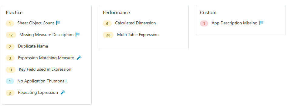
QSDA Pro 3.6 introduces Custom Flags — a way to enforce your organization’s unique standards alongside QSDA’s built-in analysis.
In addition to built-in QSDA flags that expose findings like errors and best practices, you can now define additional flags specific to your site.
Do you have unique company standards like:
Every App and master measure should have a description?
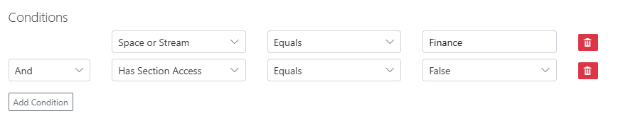
Apps in the Finance stream should have Section Access enabled?
Mobile Apps should have no more than ten objects per sheet?
You define the triggering condition, flag category and detailed flag description. Any triggered flags will appear in QSDA alongside the built-in flags. Custom flags use a distinctive icon to distinguish them from built-in flags
You can assign the new flag to one of the built-in categories like “Practice” or assign to the new “Custom” category.
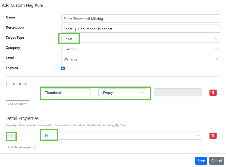
Create and edit rules under Admin > Custom Flags
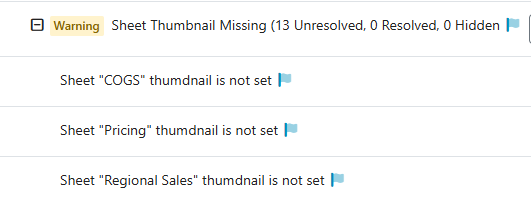
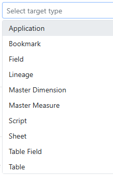
In the rule above, we define that every Sheet must have a thumbnail. When we select a Target Type of Sheet, properties of Sheet are made available in the Conditions and Detail Properties dropdowns. QSDA evaluates these conditions during analysis and raises the flag when they are met.
The Detail Properties are used to collect {n} placeholder values that can be substituted in the Description field. When this flag is raised in the QSDA analysis, the Description placeholder will be filled in like this.
You may have multiple conditions defined with and/or.
We’ve done our best to expose the data we think customers will need for rules. We currently expose these Target Types:
Each target type offers a number of different properties. If we missed something you need or you just have a question about how we can meet a specific requirement, please reach out to our friendly Motiosupport team.
QSDA Pro 3.4 was recently released and here’s a roundup of some cool new features.
QSDA Pro is a quality tool for Qlik Sense Apps. QSDA uncovers errors, advises on best practices and provides powerful tools to optimize your Qlik Apps and minimize your development time.
Apply Recommendation
Now QSDA not only makes recommendations to improve your App, but in many cases offers to make the changes for you! Pressing the “Apply Flag Recommendation” button will update your Qlik App with the recommended change — in this example replacing a free form expression with a Master Measure.
As always, QSDA is smart enough to make matches using the logical meaning of the expression rather than a limited text match.
Learn more and see “Apply Recommendation” in action in this video here.
Load Script
As requested by several customers, we are now collecting the Load Script for reference and viewing within QSDA. It’s presented in it’s multi-tab format and a search across tabs function is provided.
Deprecated Visualizations
A new flag “Deprecated Visualization” is raised for any visualization that Qlik has listed in a deprecation notice. For example, the Multi KPI. This will give your team a heads up to consult the Qlik doc for replacement options.
HTML Report
A new HTML Report option in Tools generates a formatted report from your analysis. You can use this generated report to share results outside of QSDA or serve as an artifact in your change management process.
Large App List Performance
For large App Lists we’ve instituted streamed results and paging to make the list more manageable. We still recommend you use the connection filters to focus the list to specific streams or spaces but we understand that doesn’t work for everyone.
Read the entire list of changes and usability improvements here
QSDA Pro 3.3 was recently released. Here are a few of the key features in this release.
The UI is available in Portuguese, Spanish and English.
The compact Applist displays more metrics. You can work with multiple apps and analyses in less screen space.
App memory footprint is part of the top level Applist. The memory value is highlighted when the app memory exceeds a configurable percentage of your tenant quota.
Optionally filter connections by stream or space name, or space type.
“Repeating Expression” is a new flag raised when an expression appears repeatedly in the app. The recommendation is to create and use a Master Measure.
Under the hood 3.3 contains several improvements that make the UI faster and simplifies setting up connections.
Read all the changes in 3.3 and previous releases here
Version 3.3 is the recommended release for all QSDA Pro customers. If you are upgrading from QSDA V2 be sure to read the V3 Upgrade Considerations.
Feel free to reach out to Motio Support if you have any questions about upgrading or configuring your QSDA Pro install.
Longish post today where I show off the power of QSDA Pro to reduce Qlik App resources, saving you money and creating a more responsive experience for your users.
As a follow on to my last post “Help! My Qlik Cloud Reload Exceeds Quota!” I’m going to dive deeper into the available QSDA features to reduce memory requirements of a Qlik App. As a bonus we’ll use QSDA to improve the performance of a chart.
There are many good reasons to optimize your Qlik Apps to a leaner size. Smaller apps tend to perform better and place less demand on your server resources. If you are a Qlik Cloud customer, or planning a move to Qlik Cloud, App memory size impacts your license tier — and therefore your direct monthly costs.
In this post our starting point is I that have identified the App “BikeShop Sales” as having a large (597 MB) footprint. I got this information from Qlik App Metadata Analyzer as shown below.
Qlik App Metadata Analyzer
I could also have identified this memory footprint in QSDA Pro when we select this App from the list.
QSDA Applist
Let’s see how QSDA Pro can help. I’ll launch a new Analysis and give it the Description “Baseline”.
When the analysis completes press “View” to see the results.
QSDA Analysis Summary page
In the Resources card I see that unused fields occupy 383 MB — almost 2/3 of the base data model! Unused fields are fields that are not used anywhere in the front end. They can be removed without impacting the contents of charts or the user experience.
I also see some other suggested savings in dropping unused tables (“All fields unused but keys — 439 KB”) and a 530 KB savings by AutoNumbering keys.
A fast and simple way to remove unused fields is to drop them at the end of the script with a “DROP Fields …” statement. AutoNumbering is also best done at the end of the script. Let’s implement the QSDA recommendations. Open the Qlik Data Load Editor for “BikeShop Sales” in another browser tab.
The QSDA Tools menu provides a handy Script Generator to generate recommended script statements. Select the script generator from the Tools menu.
QSDA Tools menu
In the Script Generator > AutoNumber tab select the top checkbox to select all recommended fields. Press the “Copy” button to copy the generated AutoNumber statement to your clipboard. Paste the statements at the end of your Qlik Script. Repeat for the Drop Fields and Drop Tables tabs. (I won’t use the Load Statement tab just yet).
Now that I have updated the script with the AutoNumber and Drop statements, Reload.
Reload with AutoNumber, Drop Fields, Drop Tables
Returning to the QSDA App Card, I can see that Base App Memory is now 213 MB. Quite the savings from 507 MB!
App card after reload
At this stage, I recommend running a new analysis to confirm that the script changes have not introduced any problems or new issues.
Note that Reload Peak Memory is unchanged, because we loaded the unused data before we dropped it. Reload memory has an impact on the performance of on-prem servers and for Qlik Cloud, reload memory is a direct cost.
Can we use less reload memory by not loading the unused fields and tables? It may be that a field is used the load script but is not used in the front end, so you have to examine your script to determine. This very clean script loads directly from QVDs so the answer is clear.
I’ll start by commenting (or removing) the tables we don’t need instead of dropping them at script end. To identify the unused tables I can refer to the previously generated script, the Flags, or return to the Script Generator tool in the Baseline analysis.
What about Tables with both used and unused fields? Can I easily load just the used fields and omit the unused fields? QSDA Script Generator to the rescue again. Open the Script Generator > Load Statement in the Baseline analysis and sort on the “Unused Bytes” column. Select the SalesOrderDetail table.
A Load statement fieldlist for [SalesOrderDetail] will be created with unused fields commented out. You can exclude the unused fields entirely by unchecking the “Include Unused Fields” box. I’ll start with just the SalesOrderDetail table for now. Note that the other tables with big Unused Fields savings, Notes and Customers, are already being excluded completely.
Before reloading, I’ll remove the AutoNumber and Drop statements I added earlier. Many of those drops are no longer valid as I am not loading the fields at all. Here is the updated load script.
Updated script to exclude unused fields
After reloading, I return to the QSDA App Card. Reload Mem is reduced from 693 MB to 268 MB! I’ll run another analysis to see where things stand.
I can address the remaining unused fields with DROP Fields or using the Load Statement method. I will add the AutoNumber statements back in as well. I hope the process is clear enough now so I won’t show these remaining steps in detail here.
Let’s turn our attention to another great value of QSDA — Performance improvement. The “Calc Time Distribution” chart plots the calculation time of each chart in the App. I see I have an outlier that takes about 4 seconds to calculate.
What is this chart and why is is taking to long to calculate? Flip over to the Viz page and sort by the Calc Time column. The viz in question is a Table named “Salesperson Scorecard” on sheet “Dashboard” and it takes 4.142 seconds to calculate. Expanding the row shows the chart Dimensions and Measures and also exposes the “Viz Deconstruction” icon
Viz Details
Clicking the Viz Deconstruct icon will calculate each chart Measure in turn and tell us what is taking so long to calc in this chart. We can see the total calc time is over four seconds and measures three and four take considerably longer than the first two. But why?
Let’s focus on this chart to get some insight into the cause and solution of the poor performance. Back on the Viz page, Right-click the Viz of interest and select “Filter to Selected”. This will filter our pages to only those objects — Dimensions, Expressions, etc — associated with this Viz.
Click over to the Expressions page and we’ll see that our long running expressions have flags. Flags are the advice system of QSDA, identifying errors, bad practices and performance issues. Our two second expression “Longest Deal” has a “Key Field used in Expression” flag.
Clicking the “i” icon next to the flag will open the Flag Details panel which contains a link to the help article for this flag.
In the help article we’re informed that using a key field in an expression can sometimes cause poor performance. The article goes on to advise using a non-key field instead, creating a new field if necessary. I’ll take this advice and create a new field in the SalesOrderHeader table:
Reload and change the chart Measure to use the new field.
Max(Aggr(Sum(LineSales), SalesOrderRecord))
Run a new analysis to check the calc time of the chart (and check we didn’t impact anything else!). In the summary we’ll see a significant decrease in total app calc time and we can drill into our chart to see what’s changed.
Whoa! That measure has gone from 2 seconds to 0.008 seconds.
But Rob, didn’t I just blow up my RAM by making a copy of this big field? Don’t guess, use QSDA to see exactly what the cost is.
Additional RAM of SalesOrderRecord field
The cost is 50 KB of RAM and no significant increase in Reload Mem. Was it worth it? I think so.
If you chose to put the new field on the SalesOrderDetail table instead of SalesOrderHeader, the QSDA results will quickly show you that this was a bad idea. RAM is much increased and performance not so good.
QSDA Pro gives you the tools to:
Reduce your App memory and compute requirements.
Focused advice and insight for improving your App.
Compare different solutions and measure the impact of change.
Track your progress and document the impact of your work.
I hope this post makes it clear why I say that QSDA Pro is “the tool that every Qlik developer needs”.
Do you have questions about QSDA Pro or want to schedule a demo for your team? Reach out to us.
If you’re attending Qlik Connect in Orlando, stop by the Motio booth on the show floor. I’ll be there (guy in the hat) to answer your questions and show you even more features of QSDA Pro that can help you create leaner, cleaner and faster Qlik Apps.
If you are a Qlik Cloud (SaaS) customer you may have seen this dreaded message during script reload. Ack! Ack!
Your quota may be different than 25Mb, but the problem remains the same. How do I modify this application to fit within my subscribed quota?
QSDA Pro V3.1 to the the rescue! QSDA analyzes your app and provides recommendations and easy to use tooling to drop unused data and optimize the remaining data, potentially greatly reducing the size of your Qlik App.
QSDA needs a successfully loaded app for analysis, so our first step is to reload the app using the “Limited load” feature of the Qlik script debugger.
Click the Debug button in the Qlik script editor, check the Limited load option, accept the default of 100 rows and click “Run” to initiate the reload. The reload will come in under your quota. When the reload completes, key Ctrl-s to persist the data.
You don’t have a business-ready app, but this is enough for QSDA to scan all charts, expressions and master items to determine what data is actually required.
In QSDA Pro we now select our Cloud connection and select the app of interest, in this case “BikeShop Sales2”. Click the “Open” button to prepare the app for analysis. I will also uncheck the “Collect Calctime” option because chart calculation times are not meaningful with our limited data. Description is optional, in this case I’ve entered “Limited Load”.
Click the “New Analysis” button to launch the QSDA Pro analysis. The analysis may take a minute or two to complete depending on the capacity of your tenant and the current Qlik Cloud load. When the analysis is complete press the “View” button to see the results.
In the Summary view we see there are 89 unused fields. Unused fields are fields that are not used in any charts, master items or expressions. These are fields that can be dropped at the end of script without impacting the user experience in the app. The actual storage numbers (KiB) are not meaningful because we only loaded 100 rows. The bar chart is useful in that is indicates about 2/3 of our data is unused. Hope!
QSDA provides a Script Generator in the Tools menu to generate a “DROP Fields …” script statement for unused fields. Select the script generator from the Tools menu.
In the Script Generator > Drop Fields tab select the top checkbox to select all recommended fields. Press the “Copy” button to copy the generated Drop Fields statement to your clipboard.
Paste the Drop Fields statement at the end of your Qlik Script and reload.
Reload successful! Victory!
A subsequent QSDA analysis shows the app size has been reduced from the problematic 37Mb to 15MB!
QSDA Pro can quickly and efficiently get your Qlik Apps below your Qlik Cloud quota by pruning unnecessary data. Don’t pay for more than you need.
In a follow up post I’ll walk through some additional QSDA features to help you reduce Qlik app footprint even further and improve chart response time to boot.
Download QSDA Pro and try it for yourself. Or reach out to us to learn more about license options or arrange a demo or POC for your team.
-Rob
Are you going to Qlik Connect? I’ll be at the Motio booth on the show floor ready to demo QSDA Pro or answer any questions you may have.Or just to say Hej 🙂
QSDA Pro 2.6 is available now and a new feature is Flag Levels. Each flag type is assigned a level of Info, Warning or Error with a matching color. Color helps you focus on what’s important.
Flag Levels may be customized and refined for your requirements using the new Admin > Project Config page.
“Missing Theme“. The default level for this flag is Error. A missing theme can occur when moving an App from one Qlik environment to another.
Want to learn more about QSDA Pro? Are you QSDA Pro curious or want a refresher on the capabilities and value of QSDA Pro to your Qlik development team? Join me on 24 January, 2024 for “Accelerate Your Qlik Development Through Automation” where I’ll walk you through the features of QSDA Pro and show you how QSDA can help you produce faster, leaner and cleaner Qlik Apps.
Summary: Set Modifier field names and Set Identifiers are not validated by Qlik syntax check. QSDA Pro 2.5 validates everything and raises an “Unrecognized Name” flag for invalid names.
QSDA Pro syntax checks all expressions in a Qlik App using the Qlik syntax checker. You’re familiar with the Qlik syntax checker. It’s the message at the bottom of the expression editor that tells you your expression is “OK”.
The syntax checker is also good at telling you when the expression has an error, although it’s not always specific about the problem.
QSDA Pro, using the Qlik API version of syntax checker, tells you what is wrong with the expression:
The Qlik syntax checker has a significant limitation. It does not validate field names used in sets. Whether used in the API or the editor, the syntax checker will not raise an error if the field “EmpPurchase” does not exist in the data model.
This lack of validation can be a serious problem if “EmpPurchase” is removed or renamed in the data model. The expression will still return a number but the exclusion of employee purchases will no longer be applied. That could be a very subtle but important fail.
Recognizing this limitation and it’s potential impact, QSDA Pro 2.5 validates all names used in sets and will raise a new Quality flag, “Unrecognized Name”, if the name is invalid.
Another place this validation is extremely useful is Chart Filters in Qlik SaaS. The chart will cheerily display that filter “Expression2 > 1” is being applied. Even though field “Expression2” no longer exists in the data model.
But QSDA knows.
Ever use a bookmark as a set identifier? And then the bookmark got deleted or renamed?
I’ve used simple examples to demonstrate, but where this validation really shines is in longer expressions where it may be easier to overlook that something has gone wrong.
What does QSDA stand for? Qlik Sense Document Analyzer. The combination of data model and sheets we know as an “App” in Qlik Sense was called a “Document” in QlikView. When I first created this tool in 2009 to help maintain QlikView, I called it “Document Analyzer”. When it came time to create a similar tool for Qlik Sense, I stuck with the “DA” name as the function and usefulness of “Document Analyzer” was well established in the Qlik community.
I’m pleased to announce that I’ve joined forces with Motio, Inc, producers of the great DevOps tools Soterre and Gitoqlok. Motio has acquired my QSDA Pro product and I’m excited to combine our tools to provide a comprehensive platform for professional Qlik App development in Qlik Sense and Qlik SaaS. You can read the announcement here.
I will continue to lead the development of QSDA Pro, enhancing the product and bringing new superpowers to my customers in the integration with Soterre and Gitoqlok.
The QSDA Pro customer base is growing fast! To date hundreds of organizations have purchased QSDA Pro and are realizing the full benefits of the tool. More are joining every day and I’m excited to add Motio’s dedicated product support and admin teams to handle this growth.
You can continue to learn more and purchase QSDA Pro online .
Gitoqlokis a free chrome plugin that allows you to use a git repository such as GitHub, GitLab, Azure DevOps, etc, to manage all the pieces of Qlik Sense app — Measures, Sheets, Charts, Load script and more.
The plugin operates seamlessly within the Qlik Sense authoring experience to provide the power of fine grained version control you expect with git. You’ll see a list of changes and commit those changes as you would expect in any software development project. Of course there is collision detection, branching and merging and all the goodness you expect from git.
Because the Gitoqlok team understands the visual nature of Qlik development, you can view diffs in a visual format. A slider lets you pick a commit for compare.
You can also use the same slider in a non-diff “time machine” mode to see how the application sheets looked at any point in time.
Gitoqlok comes with a lot of very useful Qlik dev features, such as the ability to import a chart or script snippet from app to another. Or deploy an entire app from one server to another!
Most Gitoqlok features are free to use. Premium features and support are available in a reasonably priced subscription.
If you are attending QlikWorld next week Drop by the Motio booth (#315) to see more. Motio is also presenting two breakout sessions showcasing Gitoqlok, including their integration with my QSDA Pro tool.
Have you ever had a Qlik Sense Visualization take longer to calculate than you like? You may have been measuring the response time with QSDA (or the older QVF QS Document Analyzer) , Add Sense or a stopwatch.
Your chart is likely made up of several expressions — Measures, color expressions, maybe reference lines. Which expression(s) are the hogs? Some? All?
In QSDA Pro version 1.4 I’ve introduced a “Viz Deconstruction” feature that calculates each chart expression individually and lets you see where time is spent. In the QSDA Pro Viz page, click the button under a Viz:
Clicking the button will pop up the Viz Deconstruction dialog. Each expression in the chart will be executed and reported individually.
For this chart I can see that one Measure takes much longer than any other expression. Now I know where to focus my efforts if I want to improve response time.
Here’s another example. Big chart, lots of data, seven Dimensions.
The Measures require over seven seconds each to generate 7M+ output rows. Maybe less detail would result in better performance and a more usable chart. I’ll uncheck a few Dimensions and
Wow! Big improvement in calc time and a more manageable number of rows.
As a final example we’ll see that long calc times are not always due to Measures.
The Measures take only a few milliseconds to calculate. But the color expression takes more then 1/2 second. Can we do this coloring more efficiently?
You may already be deconstructing charts by making clones, commenting code and remeasuring. Of course, you have to deal with the effects of caching and cleaning up after yourself. QSDA Pro provides a much faster and more structured approach.
QSDA Pro is free to try with applications containing 100 or fewer objects. If you want remove the limits, get support or acknowledge the value you get from QSDA, purchase a Monthly or Annual subscription.
I hope you find the Viz Deconstruction feature useful. I have!
-Rob
Note: There was a bug in the 1.4.0 version that kept the Deconstruction feature from calculating when using a DESKTOP Connection. This has been fixed in version 1.4.2.