
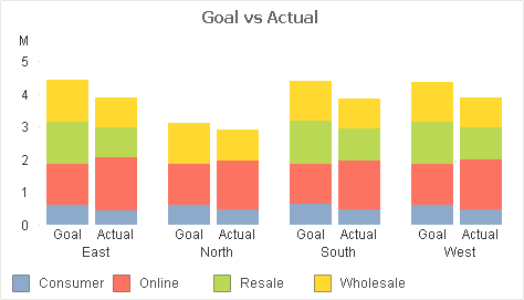
A Customer showed me this stacked bar chart and asked how to “make the Goals a different color”. What he really wanted was to differentiate the Goal stacks from the Actual stacks — but still be able to associate the Channels (Consumer, Online,…).
Channel values are expected to change over time, so any hard-coding of Channel to color would require maintainence. Here’s the Background Color expression I suggested:
if(Type=’Goal’
,argb(96,255,255,255) bitand color(FieldIndex(‘Channel’,Channel))
,color(FieldIndex(‘Channel’,Channel))
)

If that makes perfect sense to you, read no further. Otherwise let me break the expression down.
What we are doing in the expression is setting the Alpha value to “96” when “Type=Goal”. “Type=Actual” will retain the Alpha default of “255”.
Color codes in QV are made up of four numbers — Alpha, Red, Green, Blue — values which we can set in a color dialog or a color function. Alpha indicates the amount of transparency, ranging from 0 (fully transparent) to 255 (fully opaque). Colors functions without an explicit Alpha value like “RGB(0,128,0)” default to Alpha=255.
The function “Color(n)” returns the color code for the “Nth” position in the chart color palette.
FieldIndex(‘Field‘, Value) returns the position of Value in Field (by load order). This will generate a number for each distinct Channel value, regardless of how many Channel values are loaded. We are effectively assigning persistent colors because FieldIndex() is not affected by selections.
1. We use color(FieldIndex(‘Channel’,Channel)) to select color n from the palette.
2. If Type=Goal we use the boolean bitand operator to set the Alpha value for the selected color to “96” without modifying the RGB values. Adjust this 96 value for an effect of your liking.
-Rob

Finally a useful application of bitand. Great tip.
We implemented this and it seems that the FieldIndex causes significant slow-downs in rendering the charts. Is there a way to get the same effect without the use of FieldIndex?
Interesting you are seeing a slowdown. How much of a slowdown are you seeing?
Can this be used in combination with Combo chart? I have tried it with a combo chart, 1 line and 1 bar, but the different colors for each stacked bar was removed and replaced with one color.
I think the your Combo Chart issue is due to the rules for stacking related to number of dimensions and expressions. While on the Style property pane, press the Help button and read up on the rules for what can be stacked and what can not.
I faced a similar situation. But I have 3 dimensions in my case: Company, Metric and Year. The sum(value) of the metric is my expression. I have chosen year as my primary and Company as secondary dimension and the metric is stacked. I get only 2 colors when i use an expression like this:
if(Company=SubField($(vCompany),’,’,1),argb(75,255,255,255) bitand color(FieldIndex(‘Metric’,Metric)) , If(Company=SubField($(vCompany),’,’,2),argb(100,255,255,255) bitand color(FieldIndex(‘Metric’,Metric)),If(Company=SubField($(vCompany),’,’,3),argb(125,255,255,255) bitand color(FieldIndex(‘Metric’,Metric)),
If(Company=SubField($(vCompany),’,’,4),argb(150,255,255,255) bitand color(FieldIndex(‘Metric’,Metric)),If(Company=SubField($(vCompany),’,’,5),argb(175,255,255,255) bitand color(FieldIndex(‘Metric’,Metric)),If(Company=SubField($(vCompany),’,’,6),argb(200,255,255,255) bitand color(FieldIndex(‘Metric’,Metric)),If(Company=SubField($(vCompany),’,’,7),argb(255,255,255,255) bitand color(FieldIndex(‘Metric’,Metric)),color(FieldIndex(‘Metric’,Metric)))))))))
Thanks for the useful trick. One thing I noticed though is that the colour of the legend will follow the alpha-ed value instead of the “solid” one. Is there any workaround (other than masquerading a text object as the legend..)?
My experience is that the legend will be the first color form displayed. In the blog example, if “Actual” were sorted before “Goal” the legend would appear solid.
As you noted, there is always the trick of using another text object as the legend. I like to use a straight table for this.
Perfect, corresponds exactly to my problem, thanks a lot for having shared your trick !
Hy,
i tried the color trick on a Funnel Chart but no way to make it work…
BTW: Excellent Trick 😉
This is awesome…. do you have an application for QlikSense?! PLEASE!!!!
The same color expression will work in Qlik Sense in a “color by expression”. Note that if you copy/paste from this blog post you may need to correct the single quotes.
See, I’m sure you’re right, I just can’t get it! Is there a place for “Background Color” in a QlikSense bar chart? I have looked everywhere and cannot find it. Thank you for taking the time to answer me!
The QS bar chart color is in Appearance -> Colors and Legend -> deselect Colors Auto -> By Expression
When I change that color section to “by expression” it gets rid of my stacked colors. I can use your argb format to get the select company to appear more/less opaque than the others, but I lose the stacks and the bars are just a single color. I didn’t know if there was another place where I could alter the background color instead of the primary color. Right now my stacks are colored based on the UI panel in my custom theme. Which is great! But I can’t figure out this opacity for selected company thing. I’m sorry to have so many questions!
Probably best at this point if you could post your specifics on QlikCommunity where which allows for screenshots and attachments.
Okay. I’ve done that a few times, but this particular question seems tricky because it gets views but not replies. Your post was amazing and I’m glad I found your site. Thank you!
Post a link to your question and I’ll give it shot
You’re amazing!
I just reposted in the Qlik Community with a qvf attached. Here’s the link: https://community.qlik.com/t5/New-to-Qlik-Sense/Opacity-on-a-Stacked-Bar-Chart/m-p/1648228#M151458
If that doesn’t work, my post is called “Opacity on a Stacked Bar Chart” and it’s posted in New to Qlik Sense. My username is Stars. Thank you!
just great..THKS !!!
How did you achieve a grouped and stacked chart in one bar chart?
That was QlikView. Are you trying to do the same with Qlik Sense?