Summary: QV11 contained an inconsistency in how variables with equal signs were evaluated when using Alternate States. This has been fixed in QV12.10. Read on if you want the details.
QlikView V12.10 includes an important fix to variable evaluation when using alternate states. A quote from the Release Notes:
In QV11.20 the variable was expanded in the first state encountered and this resulted in a random behavior when more than one alternate state was being used. Whereas in version 12 and up, the variable always belongs to a specific alternate state and this results in different behavior.
The random behavior described in QV11.20 has generated several interesting posts to QlikCommunity with responses of “I can reproduce” / “I can’t reproduce” and few clear answers.
I find the problem confusing and interesting enough to warrant an explanation and example beyond the Release Note.
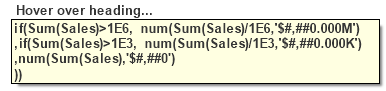
What I am describing in this post only affects variables with a leading “=” in the definition, e.g. “=Sum(Sales)”. These variables are calculated once in the context of the entire document. They are not calculated per row in a chart.
Let’s consider a variable named “vSumX” with a definition of “=Sum(X)”. The expression simply sums all selected values of X. Suppose we have two States in our document — “Default” and “State1”. There could be two different selections for “X”. Which set of X should the variable sum?
If we consider the variable definition in isolation, the answer is “Default set” as there is no set identifier in the expression. But what if the variable is referenced in an object in State1. Should the State1 values of X be used?
No matter what you think the rules should be, here’s what was happening in QV11.20. The variable was expanded (evaluated) in the first state encountered. First state encountered means first state in the calculation chain, not something the developer directly controls.
Let’s look at some examples. I’ve created a sample app (you can download here) with three States — Default, State1 and State2. The variable “vSumX” is defined as “=Sum(X)”.
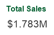
With all objects on sheet in the Default state, selections in X would yield results like this. (Note “$” indicates default state).
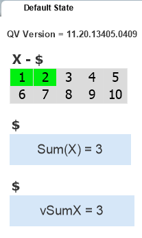
The first text box contains the expression “Sum(X)”. The second text object contains the reference to variable vSumX. The two values are what we might expect, summing the selected values of X in this state.
Let’s switch to a sheet that contains objects in the state named “State1”.
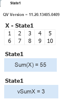
No selections in X and the first text object shows the expected result. The second object shows the value of vSumX as previously calculated from the default state. If we make selections on this State1 sheet, that will cause vSumX to be recalculated and both State1 and the Default sheet will reflect the State 1 number. Is that correct? Is it useful? It’s at least consistent and comprehensible.
My next example is where the aforementioned “random” comes into play. Let’s put objects from three states on the same sheet.
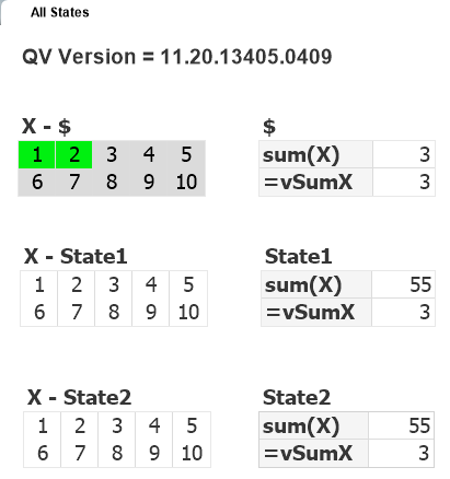
I’ve selected some values in the Default state of X and the results are what I might expect. The value of vSumX is calculated from my last selections and the variable value is consistent across objects — there is only ever one value for a variable at a given point in time.
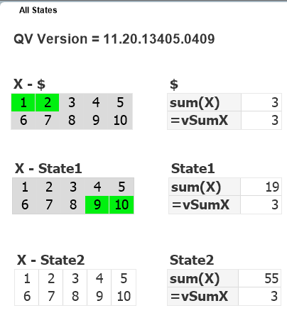
Now I select some X values in State1 and expect to see a new value (19) for vSumX. But no change! The variable was expanded (evaluated) in the first state encountered which happened to be Default ($).
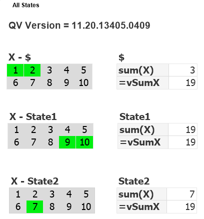
Now I select some X values in State2. If the vSumX calc used my last selection I would expect to see 7. But no, I see 19. The State1 values were used. If I repeat the exercise, it may use a different state to calc vSumX. If you test you may get different results. In this last example, State1 was used because it was the first state encountered in the calculation chain. The order is not consistent. It will be influenced by factors such as number of available processors and the order in which the objects were created.
Now that we’ve established that QV11,20 is broken in this regard, how was it fixed in QV12.10? Simple. QV12 uses set identifiers as specified in the expression, without inheritance.
=Sum(X)
will use the Default State as there is no identifier. If you want to Sum from a specific state, use it in the expression:
=Sum({State1} X)
Variables do not belong to any State. Aggregation functions used in a variable may specify a Statename, just as chart expression do. The difference is that the absence of a set identifier in a chart expression means “inherit the state from the containing object”. In a “=” variable, no set identifier means “use the default state”.
A reminder that end of standard support for QV11 comes on Dec 8, 2017. If you haven’t yet upgraded to QV12.10, I encourage you to do so. Download my QV12 Upgrade Considerations Doc as part of your planning process. Feel free to contact me if you want some assistance with your upgrade.
-Rob
Update: Qlik has extended support for QV11.20 to March 31, 2018.