
In Qlikview training we survey chart types and visualization principles. In this post I’ll walk through a recent Qlikview assignment and how I applied those design principles.
The problem statement is this. System A sends many thousand transactions daily to System B and requires a reasonable response time to support the business process involved. Occasionally, the response times are atypically high and this causes problems in the downstream processes. The high response times do not always appear in clumps. Engineers require identification of the specific problem periods and feedback on the success of their tuning efforts.
Qlikview’s aggregation and drill down capabilities seem ideally suited for this problem. What metric will support the monitoring and analysis goal?
Due to the large transaction count, looking at average response time is ineffective. Two hundred 50 second responses averaged with 10,000 1-3 second transactions will not stand out enough in an average. The customer also stated that having several outliers of 200 or 300 seconds were normal and could be explained by workloads or scheduled maintenance on System B.
While there may be other statistical measures that would work, we determined that tracking the 99% percentile would identify the problem periods. Other supporting measures will be displayed to provide context for the primary measure.
The primary measure is 99% Percentile (99% of the transactions response fall at or below this value). Supporting measures will be Transaction count, Average Response Time and Max Response Time.
When I approach a new chart I try to begin with Edward Tufte’s advice to “always know what story you are trying to tell before you design the graphic”. This story is the trend of the 99% Percentile.
Here’s my first attempt at a chart using mostly defaults. When plotting values of different magnitudes (Transaction Count and Transaction Responses) I like to use the Combo chart type.
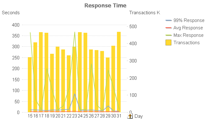
Automatic scaling causes the red “Avg Response” line to have no meaningful shape. Further, the Transaction bars have too much prominence. They are supposed to be a supporting measure to the main story.
I change the Response values to a Logarithmic scale (Properties, Axes, Log Scale) and de-emphasize the Transaction bars by making them white (Properties, Color) and with borders (Properties, Expressions, Bar Border Width=1), Here’s the result.
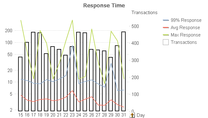
The Response line now has meaningful shape, but the Transaction bars are still too prominent.
For my next revision I split the axis vertically 75/25 (Properties, Axes, Split Axes, Primary=75%). This allows the top 75% of the chart space to represent the Response lines. The remaining 25% of the chart will host the Transaction bars. I change the bar colors to a muted gray (Properties, Colors) and remove the borders. Here’s the result.

The only prominence granted to the 99% is it’s being first in the legend, which is not enough.
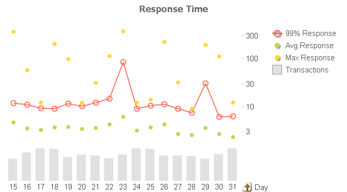
For my final revision I apply Stephen Few’s principle of color and hue to emphasize the key measure. I assign the 99% Response the red color to make it stand out. I de-emphasize the supporting measures by removing the lines and using only symbols (Properties, Expression, Display Options, uncheck Line, check Symbol). I leave Symbol on for 99% to make it easier for the user to get the hover popup and drill down.
Guided by Tufte’s “Data-Ink Ratio” principle, I remove axis numbers for the Transaction bars (Properties, Axes, Hide Axis) to make the chart less busy. The significance of Transactions is trend and it’s relationship to 99%, not the absolute value. Driven by the same principle, I remove the grid lines as they are unnecessary. The story and the objective is to identify spikes, not absolute values. Here’s my final chart.


