Summary: Qlik Script is both interpreted and evaluated. Understanding the meaning of these terms is useful in writing advanced script and understanding why some script “tricks” work and others don’t.
In my Advanced Scripting session at the Masters Summit for Qlik, I sometimes begin with the question “What does $() do in script?”. A common answer I hear is “it causes the variable contents to be treated as an expression and evaluated”. While in some cases this is the practical result, the answer is incorrect.
$() “Dollar Sign Expansion or DSE”, which takes place during interpretation, replaces the variable name with the value of the variable. This process is called “expansion” or “substitution”. The new value may subsequently get evaluated as an expression during the evaluation phase, but only if an expression is expected in that specific script statement. Let’s take a look.
SET vVal = 1 + 1; // expecting "1 + 1"
LET v1 = $(vVal); // expecting "2"
SET v2 = $(vVal); // expecting "1 + 1"
$(vVal) will substitute the contents of the vVal variable which is the string “1 + 1”. After execution, we expect v1 to be “2” because the behavior of a LET statement is to evaluate what is to the right of the equal sign as an expression. We expect v2 will be “1 + 1” because the documented behavior of the SET statement is to treat the value to the right of equals as a literal string, not an expression.
The individual pieces of a script statement are carved up by the script parser into “symbols” or tokens. The script language definition defines what types — Expressions, Literals, Numbers, etc. — are valid for each symbol. Only symbols defined as Expressions will be evaluated as such.
The TRACE statement expects a String as it’s symbol. We can’t calculate a dynamic value within the TRACE statement itself. We must calculate the value into a variable and then reference the variable like this:
LET vRows = NoOfRows('Orders');
Trace Orders has $(vRows) rows;
It would be useful if script supported the “$(=)” DSE form, like Set Analysis. Then we could do something like this.
Trace Orders has $(=NoOfRows('Orders')) rows;
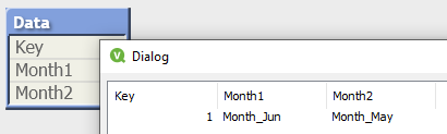
Simple enough so far. Let’s look at some more subtle examples. A user on Qlik Community posted a requirement to dynamically form several fieldnames in a load statement based off the current date. She wanted to load a specific field as ‘Month_MMM’ where MMM is the current month-1, another field as current month-2 and so on. She created a reusable (good idea) variable-with-parameter to create the names:
SET vMonthFieldname = 'Month_' & Date(AddMonths(today(),$1),'MMM');
If called in July as $(vMonthFieldname(-1)) the expected return value would be “Month_Jun”. The LOAD statement would look something like:
LOAD
  Key,
  field1 as [$(vMonthField(-1))],
  field2 as [$(vMonthField(-2))]
This script executed without error, but to her surprise the final table had unexpected field names:

The variable expansion took place during interpretation, returning the expression string that was intended to form the fieldname. However, the “as aliasname” clause only expects a literal so no evaluation took place and the string was used as-is for the fieldname. Like the TRACE example, the workaround would be to first build the values using LET:
LET vMonth1=$(vMonthField(-1));
LET vMonth2=$(vMonthField(-2));
Data:
LOAD
  Key,
  field1 as [$(vMonth1)],
  field2 as [$(vMonth2)]
How about if we used vMonthField as the fieldref parameter (to the left of the “as” keyword)?
LOAD
  Key,
  $(vMonthField(-1)) as Month1,
  $(vMonthField(-2)) as Month2
The symbol to the left of “as” may be an Expression, so this would generate expected values. (Admittedly, this is not what the poster asked for, I include it only for illustration).
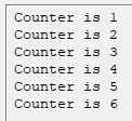
Let’s visit another illustration of interpretation and evaluation. How many times will this loop execute?
SET vCounter = 1;
Do While $(vCounter) <= 3
  TRACE Counter is $(vCounter);
  LET vCounter = $(vCounter)+1;
Loop
If your answer is “forever”, you are correct. Looking at the progress window, we can see the counter increments beyond 3 but the script continues running.
The script execution log is where we can see what script looks like after interpretation and DSE.
2019-07-25 00:48:17 0021 Do While 1 <= 3
2019-07-25 00:48:17 0022 TRACE Counter is 1
2019-07-25 00:48:17 0022 Counter is 1
2019-07-25 00:48:17 0023 LET vCounter = 1+1
2019-07-25 00:48:18 0025 Loop
2019-07-25 00:48:18 0022 TRACE Counter is 2
2019-07-25 00:48:18 0022 Counter is 2
2019-07-25 00:48:18 0023 LET vCounter = 2+1
2019-07-25 00:48:19 0025 Loop
2019-07-25 00:48:19 0022 TRACE Counter is 3
2019-07-25 00:48:19 0022 Counter is 3
2019-07-25 00:48:19 0023 LET vCounter = 3+1
The Do While condition is fixed at “1 <= 3” which will always be true! According to the documentation for Do While:
The while or until conditional clause must only appear once in any do..loop statement, i.e. either after do or after loop. Each condition is interpreted only the first time it is encountered but is evaluated for every time it is encountered in the loop.
The doc tells us our $() expansion — which is interpretation — will happen only once. Evaluation, on the other hand, will be done repeatedly. The correction to the loop will be to remove $() so our statement looks like this:
Do While vCounter <= 3
This is a valid expression and the loop will execute only 3 times.
So where do we need $() in this loop? We need it in the TRACE because we do not have evaluation, only interpretation. The While condition and the LET symbol both allow Expressions, therefore we can count on evaluation to get the current variable value.
Do While vCounter <= 3
  TRACE Counter is $(vCounter);
  LET vCounter = vCounter + 1;
Loop
I hope this discussion and examples help you to understand script interpretation and evaluation, especially in the context of $().


