|
Source
|
Destination
|
Ratio
|
Example
Result
|
Notes
|
|
Source DB
|
–
|
2GB
|
Raw Data
|
|
|
Source DB
|
Document RAM
|
10:1
|
200MB
|
Data de-duplication
|
|
Document RAM
|
QVW Disk
|
3:1
|
67MB
|
Save Compression=High
|
|
Document RAM
|
QVW Disk
|
1:1
|
200MB
|
Save Compression=None
|
|
QVW Disk
|
Document RAM
|
1:3
|
200MB
|
Save Compression=High
|
|
QVW Disk
|
Document RAM
|
1:1
|
200MB
|
Save Compression=None
|
|
Document RAM
|
QVD Disk
|
1:1
|
200MB
|
QVD always uncompressed
|
|
QVD Disk
|
Document RAM
|
1:1
|
200MB
|
Optimized load
|
|
QVD Disk
|
Document RAM
|
1:2
|
400MB
|
Non-Optimized load
|
All posts by Rob Wunderlich
QVD Questions and Answers
Q: How do you write out to a QVX?
Q How can you read QVX from other software than Qlikview .
Incremental Load using SQL Server “timestamp” Data Type
Incremental Load (extracting only new or changed rows from the database) requires a table column that identifies when a row has been updated. This is usually a datetime column like “LastUpdate”. The script extracts the max timestamp from the existing QVD and uses it to create a select predicate like:
WHERE LastUpdate >= ’01-20-2010 13:55:01′
If the database is Microsoft SQL Server, you may have another option for identifying updated rows. A table column of type “timestamp” is incremented whenever a row is changed. The name “timestamp” in somewhat confusing, as this column does not contain time values. Here is the description from the 2005 Reference:
“timestamp is a data type that exposes automatically generated, unique binary numbers within a database. timestamp is generally used as a mechanism for version-stamping table rows. The storage size is 8 bytes. The timestamp data type is just an incrementing number and does not preserve a date or a time. To record a date or time, use a datetime data type.”
In Sql Server 2008, the type “rowversion” was introduced as an alias for “timestamp”. Rowversion is preferred for 2008 and forward.
If your table does not already have a timestamp column, you can add one with an ALTER DDL statement, For example, to add a timestamp column named “Revision” to a table named “Orders”:
alter table Orders ADD [Revision] [timestamp] NOT NULL;
The Revision column will be returned by default as a hexadecimal string, so it’s easiest to convert to an integer before storing in QV.
SQL SELECT
OrderID, etc,
cast(Revision as bigint) as Revision
FROM Orders …
In subsequent incremental loads, add a predicate to select only rows greater than the last revision.
// Select the max value from the qvd
tempmax:
LOAD max(Revision) as Revision FROM myqvd.qvd (qvd);
LET vMaxRevision = PEEK(‘Revision’);
DROP TABLE tempmax:
SQL SELECT
OrderID, etc,
cast(Revision as bigint) as Revision
FROM Orders
WHERE Revision > $(vMaxRevision);
–Rob
Deconstructing Chart Design
In Qlikview training we survey chart types and visualization principles. In this post I’ll walk through a recent Qlikview assignment and how I applied those design principles.
The problem statement is this. System A sends many thousand transactions daily to System B and requires a reasonable response time to support the business process involved. Occasionally, the response times are atypically high and this causes problems in the downstream processes. The high response times do not always appear in clumps. Engineers require identification of the specific problem periods and feedback on the success of their tuning efforts.
Qlikview’s aggregation and drill down capabilities seem ideally suited for this problem. What metric will support the monitoring and analysis goal?
Due to the large transaction count, looking at average response time is ineffective. Two hundred 50 second responses averaged with 10,000 1-3 second transactions will not stand out enough in an average. The customer also stated that having several outliers of 200 or 300 seconds were normal and could be explained by workloads or scheduled maintenance on System B.
While there may be other statistical measures that would work, we determined that tracking the 99% percentile would identify the problem periods. Other supporting measures will be displayed to provide context for the primary measure.
The primary measure is 99% Percentile (99% of the transactions response fall at or below this value). Supporting measures will be Transaction count, Average Response Time and Max Response Time.
When I approach a new chart I try to begin with Edward Tufte’s advice to “always know what story you are trying to tell before you design the graphic”. This story is the trend of the 99% Percentile.
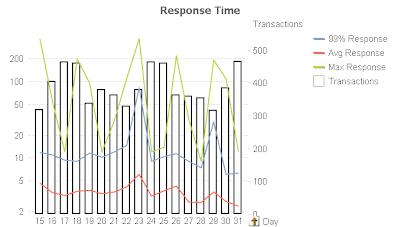
Here’s my first attempt at a chart using mostly defaults. When plotting values of different magnitudes (Transaction Count and Transaction Responses) I like to use the Combo chart type.
Automatic scaling causes the red “Avg Response” line to have no meaningful shape. Further, the Transaction bars have too much prominence. They are supposed to be a supporting measure to the main story.
I change the Response values to a Logarithmic scale (Properties, Axes, Log Scale) and de-emphasize the Transaction bars by making them white (Properties, Color) and with borders (Properties, Expressions, Bar Border Width=1), Here’s the result.
The Response line now has meaningful shape, but the Transaction bars are still too prominent.
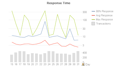
For my next revision I split the axis vertically 75/25 (Properties, Axes, Split Axes, Primary=75%). This allows the top 75% of the chart space to represent the Response lines. The remaining 25% of the chart will host the Transaction bars. I change the bar colors to a muted gray (Properties, Colors) and remove the borders. Here’s the result.
The only prominence granted to the 99% is it’s being first in the legend, which is not enough.
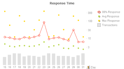
For my final revision I apply Stephen Few’s principle of color and hue to emphasize the key measure. I assign the 99% Response the red color to make it stand out. I de-emphasize the supporting measures by removing the lines and using only symbols (Properties, Expression, Display Options, uncheck Line, check Symbol). I leave Symbol on for 99% to make it easier for the user to get the hover popup and drill down.
Guided by Tufte’s “Data-Ink Ratio” principle, I remove axis numbers for the Transaction bars (Properties, Axes, Hide Axis) to make the chart less busy. The significance of Transactions is trend and it’s relationship to 99%, not the absolute value. Driven by the same principle, I remove the grid lines as they are unnecessary. The story and the objective is to identify spikes, not absolute values. Here’s my final chart.
Alert Questions & Answers
I received several questions regarding my post Monitoring the Reload Schedule. Surprisingly the questions were not about the monitoring solution, but rather using Alerts. I’ll summarize the questions and answers here.
Can I loop through field values in an Alert?
Not directly. But you can create multiple alerts that use either bookmarks or set analysis in the Condition to handle a known set of field values. For example create one alert for Region=US and a second for Region=Europe and each sends an email to the associated Regional Manager.
Can I use an alert to always send an email?
Yes. Just set the Condition to “-1” (without quotes). This is always true and can be used to send text “mini-reports” to your email recipients. Your email text might be something simple like:
=’Currently open tickets: ‘ & sum(OpenTicketCounter)
Or something more complex like:
=’YTD Sales are ‘
& money(
sum({1
<[Invoice Year]={$(=year(today(2)))}>
}
Quantity * Price
)
, ‘$#,##0;($#,##0)’
)
& ‘
YTD Orders are ‘
& num(
sum({1
<[Order Year]={$(=year(today(2)))}>
}
Quantity
)
, ‘#,##0’
)
This will generate an email body that looks like:
YTD Sales are $12,014,788
YTD Orders are 167,580
You can build up complex expressions in a Text Object to get them correct and then paste to the Alert.
Can I include a chart image in an alert email?
No. If you know of a method, please leave a comment.
It may be helpful to include a url in the email that opens the Qlikview document for further analysis.
If you have Alert questions or tips, please leave a comment.
-Rob
Monitoring the Reload Schedule
Monitoring successful operation is an important aspect of any IT system. What kind of monitoring is useful for Qlikview? I’ve found the following monitoring important in a Qlikview Server installation:
- Notification of individual reload failures. This capability, sending an email on reload failure, is included in all editions of Qlikview Server.
- Status of Qlikview services. Most shops have a network monitor such as Servers Alive to monitor and send alerts about status of Windows services.
- A particularly effective style of monitoring is “goal” monitoring. That is, instead of monitoring the resources required to achieve a goal, monitor the goal itself. In Qlikview terms, this means confirming that a set of Qlikview documents has been updated as scheduled.
In this post I’ll look at using a Qlikview document to monitor the filetimes of Qlikview Server documents. An “old” filetime is an indication that a reload or distribution has been missed. An email notification will be sent when we are off schedule.The mail body will look something like this:
4 documents overdue: Expenses_Joe.qvw, Expenses_Rob.qvw, Expenses_Sally.qvw, fieldIndex.qvw
The code used in this post can be downloaded at File Age Monitor. Download and extract the three files:
FileAgeMonitor.qvw — monitoring document.
FileAgeMonitor_Rules.txt — Filename masks and maximum expected age.
FileAgeMonitor_Email.txt — Address(s) to send alert about overdue documents.
To use FileAgeMonitor in your shop you’ll need to make the following changes:
- On the “Configuration” script tab, specify the directories you want to scan for qvw files.
- Modify FileAgeMonitor_Rules.txt to specify rules meaningful to your installation, Instructions are in the file.
- Modify FileAgeMonitor_Email.txt for your email address. Instructions are in the file.
FileAgeMonitor_Rules.txt consists of two fields:
– a filename mask (Key)
– a maximum allowable age in hours (MaxAge).
Lines beginning with “#” are comments. Example:
Key, MaxAge
# Rules file for FileAgeMonitor.qvw. First match wins.
# “Filename Mask”, “Max allowable age in hours”
# All of the Expenses* docs should be no more than 25 hours old
Expenses*.qvw, 25
#Films can be 90 days old
Films.qvw, 90*24
# Everything else – catch all default – 7 days
*, 7*24
The first field, “Key” is a filename mask that may use the standard Qlikview wild card characters of “*” to match any number of characters and “?” to match a single character.
The second field, “MaxAge”, is the threshold age at which a file is considered “overdue”. MaxAge may contain any expression that evaluates to a numeric value. The value is hours.
The last entry in the Rules files, “*” will match all files.
The script builds a list of qvw files and matches each filename against the entries in the Rules file. The first match wins. The age of each file is tested against it’s matching rule and the flag field “Is Overdue?” is set to Y or N. The flag field is defined as a dual:
if(FileAge > MaxAge, dual(‘Y’,1), dual(‘N’,0) )
as “Is Overdue?”.
Y has the dual value 1, N the value 0. This allows the flag to be summed.

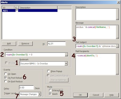
So now we have a chart that displays what’s overdue, but how about automatic notifications? For that we’ll use a Document Alert. Alerts are created from the Tools menu. Here’s the alert defined used to send the email. Refer to the notes that follow the picture.
1. Before the condition is evaluated, apply the bookmark that selects “Is Overdue?”=Y.
2. The alert condition is specified as:
=sum([Is Overdue?]) > 0
Recall that “Is Overdue?” was defined as a dual so it may be summed. If there are any overdue documents, the condition will be true and the alert will “fire”.
3. Both the Mail subject and mail body contain the count of overdue documents. The body contains the document names as well. The body expression is:
=sum([Is Overdue?]) & ‘ documents overdue: ‘ & concat(FileName, ‘, ‘)
4. The email will be sent to the addresses that were loaded into field “AlertTo”. The script loaded this field from the file FileAgeMonitor_Email.txt.
5. Batch Mode limits this alert to server based reload only. If Interactive were checked, the alert may fire when we are reloading during Development.
6. The Alert will be tested at the end of each reload.
7. The trigger level is set to “Message Changes”. This means a new email will be sent only when the count of overdue documents changes. So we will not get an hourly email telling us that “10 docs are overdue”, but will receive a new email if the next reload produces an overdue count of 8 or 12 — something different than 10.
FileAgeMonitor itself needs to be scheduled to reload periodically. I schedule it to run towards the end of interval reload cycles. For example, if there are hourly reloads at the top of the hour, I schedule FileAgeMonitor at 45 minutes after the hour.
If FileAgeMonitor relies on Server scheduling, and the entire scheduling process fails, how will FileAgeMonitor be able to tell us that reloads are not running? This is the “monitoring the monitor” problem that inevitably occurs with system monitoring. I address this issue by monitoring the Filetime of FileAgeMonitor.qvw using an external monitor like Servers Alive.
Qlikview reloading can get “off schedule” for any number of reasons; Database errors, Administrator errors. bugs in the scheduling software. It’s important for the Administrator to know of exceptions and their scope as quickly as possible.
-Rob
The Now() Trap
The Now() function operates differently in script and charts. This post will highlight one difference that has tripped up even experienced developers.
Our example script requirement is to extract rows of data where the “TransactionDatetime” field value is within the last 24 hours. We’ll use the “Now()” function to establish the current time. Here’s the doc from the QV Ref Guide.
now( [ timer_mode ] )
Returns a timestamp from the system clock. The timer_mode may
have the following values:
0 Time at script run
1 Time at function call
2 Time when the document was opened
Default timer_mode is 1. The timer_mode=1 should be used with
caution, since it polls the operating system every second and hence
could slow down the system.
Which timer_mode option do you choose? Hmm… you want 24 hours prior to the script execution so it seems like “0” is the best option. Plus there is that scary warning about “1” slowing down the system.
The integer 1 represents a day — 24 hours — so you code a where clause in your LOAD like:
WHERE TransactionDatetime >= now(0) -1
During development, you reload several times. You examine the data selected and it seems to be working — you are getting data from the last 24 hours. It’s 4:00pm Tuesday afternoon and you promote this to the server and set a reload schedule of daily at 8:00am. A test run on the server shows the data selection is working as planned.
The document reloads on schedule at Wednesday 8:00am. A review of the app shows data going back to Monday at 4:00pm. After Thursday morning’s reload the data range is Tuesday 8:00am to Wednesday 8:00am. What happened to the rest of Wednesday and all of Thursday?
The value for Now(0) is set at the end of script execution. When used in script, Now(0) returns the end time of the previous script execution, not the time of the current script execution.
So on Thursday morning Now(0) returns Wednesday 8:00am — the end of the last execution. That is not what we were looking for.
In Charts, Now(0) returns the end of the latest script execution, which would be Thursday 8:00am.
Now(1) always returns the time when the function is executed — the “current” time. During development when reloads are frequent, script Now(0) is usually pretty close to Now(1) and you may not notice the difference. But when a document goes on a daily reload schedule, Now(0) is usually an entire day behind what you want!
The correct choice in script is generally Now(1), which returns the time when the function is actually executed, not a time related to previous reload.
To Summarize, use Now(1) in script, Now(0) in charts.
If you need to establish a deterministic (consistent throughout the entire script) value for “Now” in script, set a variable at the beginning:
LET vScriptStart – Now(1);
Then use vScriptStart as the reference point in your script. It may also be used in charts as well.
-Rob
Use cases for Generic Load
Generic Load is the complement of “Crosstable Load”. In a loose sense, you could say that aCrosstable Load creates a Generic table and Generic Load creates a Cross table.
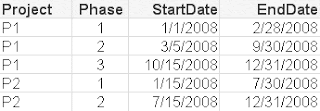
Consider this table which contains a separate row for each Phase of a Project.
RESIDENT ProjectTable;
GENERIC LOAD Project, ‘End Phase ‘ & Phase, EndDate
RESIDENT ProjectTable;
Generic Load creates additional Qlikview tables. The additional tables cannot be avoided by combining a CONCATENATE or JOIN prefix. In the next example I’ll offer a technique to consolidate the tables.
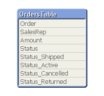
Here’s another application of Generic. Consider this example table.
Suppose you want to generate flag fields for each of the possible order statuses? The flags could be created with a single Generic Load.
Flags:
GENERIC LOAD Order, ‘Status_’ & Status, 1
RESIDENT OrdersTable;
The resulting data model now contains flags for each Order.
As mentioned previously, Generic Load creates additional tables. The table view after the above Generic Load is:
FOR i = NoOfTables()-1 to 0 STEP -1
  LET vTable=TableName($(i));
  IF WildMatch('$(vTable)', 'Flags.*') THEN
    LEFT JOIN (OrdersTable) LOAD * RESIDENT    [$(vTable)];
    DROP TABLE  [$(vTable)];
  ENDIF
NEXT i
Here’s the table view after the Joins.
The qvw examples used in this post may be downloaded from here.
Reusing expressions — chart column references
It’s often useful to avoid repeating lengthy expressions. Here’s one technique for reusing expressions.
Let’s add another column for “Commission”, defined as 10% of Net. Instead of repeating the Net calculation, use the expression:
=Net * .1
Qlikview allows referencing the value of another column in the same chart by name. The name is the value assigned to the column label. “Net” in this case is not a Field. It is a symbolic reference to an expression. It may be used in other expressions in the same chart, but not in places where a Field name is expected.
=Net / 2 Allowed
=above(Net) Allowed
=Sum(Net) Not allowed
Column references can be very useful in Expression attributes. Let’s bold any Commission value over $200. We’ll use a Text Format expression of:
=if(Commission > 200, ‘<B>’)
giving this result:
-Rob
Best way to count keys? Don’t.
I was recently reviewing a problem where a chart Count() function produced differing results between QV 8.5 and 9. The field being counted was a key field. Counting a key field without using DISTINCT, especially a one-to-many key, can produce ambiguous results and should be avoided.
The recommended approach is add a counter field and sum() that field. For example, in an Orders table, add the field:
1 as OrderCounter
and then count Orders with:
sum(OrderCounter)
Yes, count(OrderCounter) will work as well. The Qlikview literature still states that sum() is faster and preferable to count(). John Witherspoon recently showed me some tests that demonstrate count() being faster than sum() in Version 9, so it’s possible that recommendation should be examined if you are working on a very large application.
-Rob

